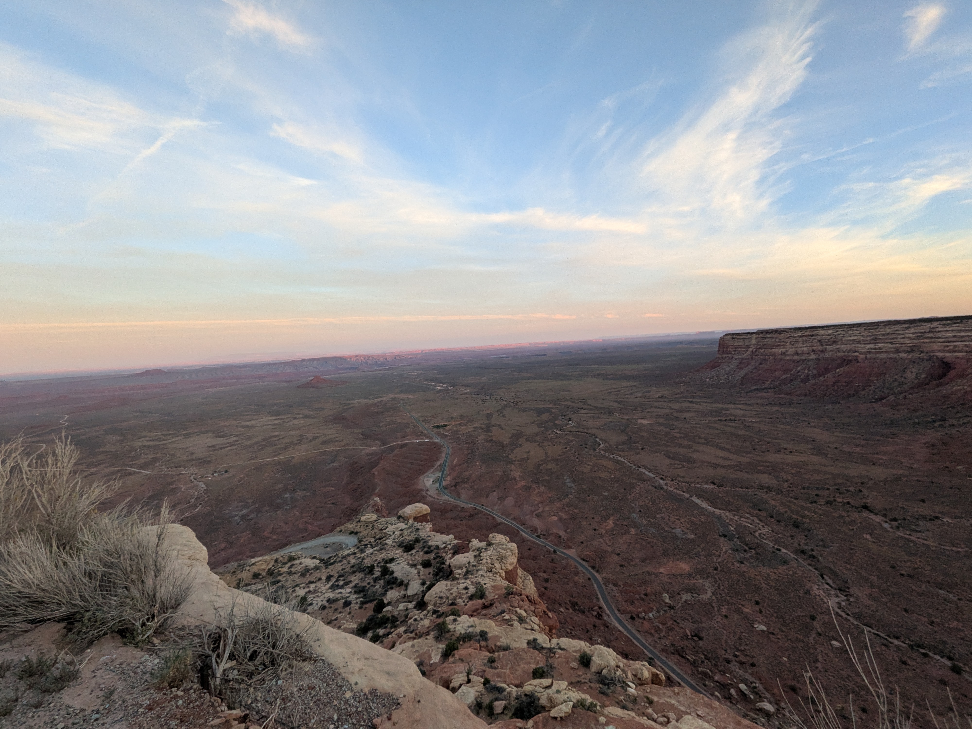
After recently graduating from U of T, I figured it was finally about time I updated my personal website — which funnily still claimed I was in second year (yes, I do in fact age). Between a month-long trip out west and founding a startup, I believe I've finally settled on a final design.
What actually changed
- My old website was lacking in character, so I added subtle gradient backgrounds, soft shadows, and a consistent motion language across the whole site.
- I also finally got around to reworking the project showcase, so hovering a card now surfaces a real description, tech-stack tags, and a call to action instead of just a dim overlay.
- Replaced the old click-to-switch navigation with genuine continuous scroll and a scroll-spy that highlights the right nav item as you go.
- Rebuilt image loading around a custom lazy-loader.
- Refreshed the contact page.
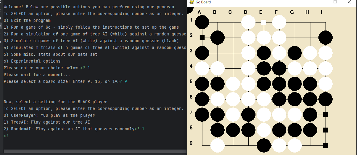
- Added this blog so I have somewhere to write about projects, research, and Go (the board game, not the language — though I have plenty to say about both).
- Verified the whole site against a mobile-sized viewport.

Lessons in motion and micro-interactions
The easiest way to make a static site feel "modern" turned out to be restraint: a handful of consistent transitions (one easing curve, one hover-lift distance, one shadow scale) reused everywhere, rather than a different animation per component. This saves both development time and keeps interactions predictable for the user.
I also made sure every animation respects prefers-reduced-motion, which resolved some
previously janky transitions.
Continuous scroll over fake routing
The old version faked a single-page app: every section was a fixed, full-screen panel, and clicking
a nav link swapped which one had the active class. It worked, but it wasn't really
scrolling — and native anchor navigation, smooth-scroll CSS, and my own click handlers kept
fighting each other, occasionally leaving the page stuck at some arbitrary offset mid-transition.
The new version stops faking this: sections are now normal in-flow blocks, an
IntersectionObserver watching the middle 10% of the viewport keeps the sidebar nav in
sync as you scroll, and clicking a nav link just calls scrollIntoView directly.
One issue I found is that although loading an image only once it's already on screen looks fine on a slow scroll, you can outrun the network and see a blank flash on faster scrolls. The fix was a generous lookahead: images start fetching roughly 1200px before they'd actually be visible, which is relatively cheap on a site this size.
What's next
I hope to update this blog a bit more often in the future. I'd like to write about the CPU side-channel fuzzing work I did at the SITH Lab over the last (nearly) two years. Additionally, I intend to do a write-up on my experiences during my 4 years at U of T (sorta like a post-CTF) — I'll try not to be too biased. I was also recently on a month-long grad trip on the west coast, so stay tuned for some photos and vlogs.